
Alles, was Sie über Cremefarbe wissen müssen
The cream is a warm and soft color which is associated with simplicity and elegance. This type of color sits between beige and white, prompting a wonderful alternative to the stark white while maintaining the airy feel and light.
Cream color code has been used in the several business-related projects, and a lot of people adopt the cream colors for fashion purposes. This post aims to reveal all the details about the cream color and we'll also explore the applications of the cream colors in several fields.
Part 1. What is Cream Color?
Cream color is a fascinating pale yellowish-white color that tends to resemble the natural and rich hue of dairy cream. Cream color is a bit softer than pure white, and it comes with a warm undertone, making it versatile and inviting. Cream color Hex code is #FFFDD9 and it is used in the design courtesy of the neutral quality, allowing it to blend seamlessly with various other colors.
This type of the color has the negging of the feelings of relaxation, calmness, and subtle luxury, making it a perfect gig for practical and aesthetic applications. If you look at the history of the cream color, it has been used in design and art for decades, showing purity and sophistication.
You can see the colour in the high-end fashion, classical paintings, and luxurious interiors. Although, cream colour doesn't force you to notice it instantly it can enhance the beauty of the surrounding elements, producing a refined and balanced look.

Part 2. Cream Color in Different Fields
There are several fields of the cream colour, and a few of the most common ones are given below.
1. Interior Design
The cream is a prolific choice in interior design as it produces a welcoming atmosphere and cosy atmosphere. It serves the walls, furniture and different accessories as the base color offering the classic and modern styles. Cream color tend to pair with deep hues, pastels, and earth tones like forest green or navy to produce an elegant and balanced look.
One of the key points of the opting for the cream color in the interior is its ability to represent the natural light, offering the spaces more open and larger. Cream color could be a brilliant backdrop for the different materials and textures, including the ye textiles, metal, and woods. Various interior designers tend to favour the cream for its adaptability and quality to changing trends.
2. Fashion
Cream color Hex code has also been used in the fashion industry as it is a sophisticated and timeless color that shows simplicity, class, and elegance. Cream cold is used in casual outfits, bridal dresses, and formal wear. The versatility of the cream color helps the color to pair with the neutral and bold color to make the wardrobe stable look outstanding and breathtaking.
Cream colored garments are linked with the effortless and refinement style, making the cream color is ideal for special occasions and everyday wear. Moreover, cream color could also be used in accessories and luxury fashion and you can see this color in footwear. Green color will symbolize the grace and elegance making it a brilliant thing for high-end fashion brands. Since the dream college comes up with neutrality, it is combined with the textures, including leather, wool, and silk to produce a visually appealing look and Graphic Design.
3. Branding and Graphic Design
The trend of using the cream color is also common in graphic design and branding as the cream color offers a soft feel, making it one of the most demanding colors for different brands. Graphic designers or brands that want to make their project look elegant and aesthetic can mix cream colors into their marketing color, packaging and logos.
This type of color is couple with black, brown and gold colors to produce a luxurious brand identity quickly. Many wellness and skincare brands also use the cream times in the packaging to show a sense of natural beauty and purity.
High-end boutiques and restaurants could also use the cream in the branding to produce an inviting and sophisticated atmosphere. The ability of the colour to evoke a calm feeling and trust just makes the cream color look more watchable. On top of that, Graphic designers have liked the fact that cream could be mixed with the other colors harmoniously without overpowering the design. It comes up with a natural base that tends to enhance the illustrations, typography and other design elements, making it a brilliant choice for elegant branding strategies.
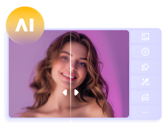
Teil 3. Das beste Tool zur Anpassung von Cremefarbenen Bildern mit HitPaw FotorPea
HitPaw FotorPea ist mit Abstand der beste Weg, um cremefarbene Bilder anzupassen, da es Ihnen ermöglicht, diese automatisch zu generieren. Neben einer einfachen Benutzeroberfläche stellt HitPaw FotorPea sicher, dass Sie mehrere Bilder gleichzeitig generieren können. Darüber hinaus fügt HitPaw FotorPea kein Wasserzeichen in die generierten Bilder ein.
Funktionen
- Ermöglicht die Erstellung von cremefarbenen Bildern
- Unterstützt Mac und Windows
- Generiert mehrere cremefarbene Bilder gleichzeitig
- Kein Wasserzeichen in den generierten cremefarbenen Bildern
- Kompatibel mit Mac und Windows


Wie erzeugt man cremefarbene Bilder mit HitPaw FotorPea?
Schritt 1: Nachdem Sie HitPaw FotorPea gestartet haben, müssen Sie die Schaltfläche "AI Generator" auswählen.
Schritt 2: Wählen Sie die Schaltfläche "Type What you want to see" und geben Sie die Textbeschreibung der gewünschten Cremefarbe ein.
Schritt 3: Nachdem Sie die Auflösung und die Stile ausgewählt haben, müssen Sie auf die Schaltfläche "Generate" tippen, um die cremefarbenen Bilder zu erstellen. Überprüfen Sie anschließend die Bilder und wählen Sie die Schaltfläche "Download", um die Fotos zu exportieren.
Teil 4. FAQs zu Cremefarben
Q1. Welche Farbe ist beige im Vergleich zu cremefarben?
A1. Creme und Beige sind beides neutrale Farben, die sich jedoch in einigen Punkten deutlich unterscheiden. Beige hat einen bräunlicheren und etwas dunkleren Unterton, während Cremefarbe heller erscheint und einen gelblichen Farbton enthält. Beige bietet einen gedämpften, erdigen Ton, während Creme einen zarteren und weicheren Look bietet.
Q2. Welche Farbe ist Creme oder Elfenbein?
A2. Elfenbein und Creme sind ziemlich ähnlich, aber Elfenbein wirkt im Vergleich zur Cremefarbe etwas kühler. Elfenbein bringt einen Hauch von Grau mit sich, so dass es irgendwie nicht weiß aussieht, während Creme einen gelben Unterton und einen warmen Look hat, der die Farbe attraktiv und ansehnlich macht.
Q3. Was ist der Cream Color Code?
A3. Der Hexadezimalcode für Creme ist #FFFDD0.
Abschließende Worte
Cremefarben ist eine vielseitige und zeitlose Farbe, die in verschiedene Aspekte von Design, Branding und Mode integriert wird. Die eleganten und warmen Eigenschaften der Cremefarbe machen sie hervorragend für die Schaffung beeindruckender Ästhetik.
Egal, ob Sie die Cremefarbe für Marketing, Kleidung oder Wohnkultur verwenden möchten, Creme steht als Symbol für Luxus und Ruhe. Wenn Sie cremefarbene Bilder generieren möchten, ist HitPaw FotorPea die beste Wahl. Mit diesem Tool können Sie verschiedene Bildstile erkunden, ohne die ursprüngliche Qualität zu beeinträchtigen, und es unterstützt auch die Stapelerstellung.
 HitPaw VikPea
 HitPaw Univd
 HitPaw VoicePea


Teilen zu:
Wählen Sie die Produktbewertung:
Joshua Hill
Chefredakteur
Ich bin seit über fünf Jahren als Freiberufler tätig. Es ist immer beeindruckend Wenn ich Neues entdecke Dinge und die neuesten Erkenntnisse, das beeindruckt mich immer wieder. Ich denke, das Leben ist grenzenlos.
Alle Artikel anzeigenEinen Kommentar hinterlassen
Eine Bewertung für HitPaw Artikel abgeben